Usability Testing Review
Our Three Usability Tests
First Test
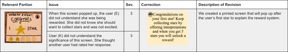
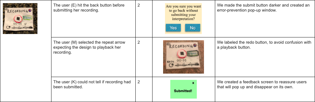
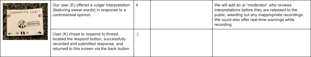
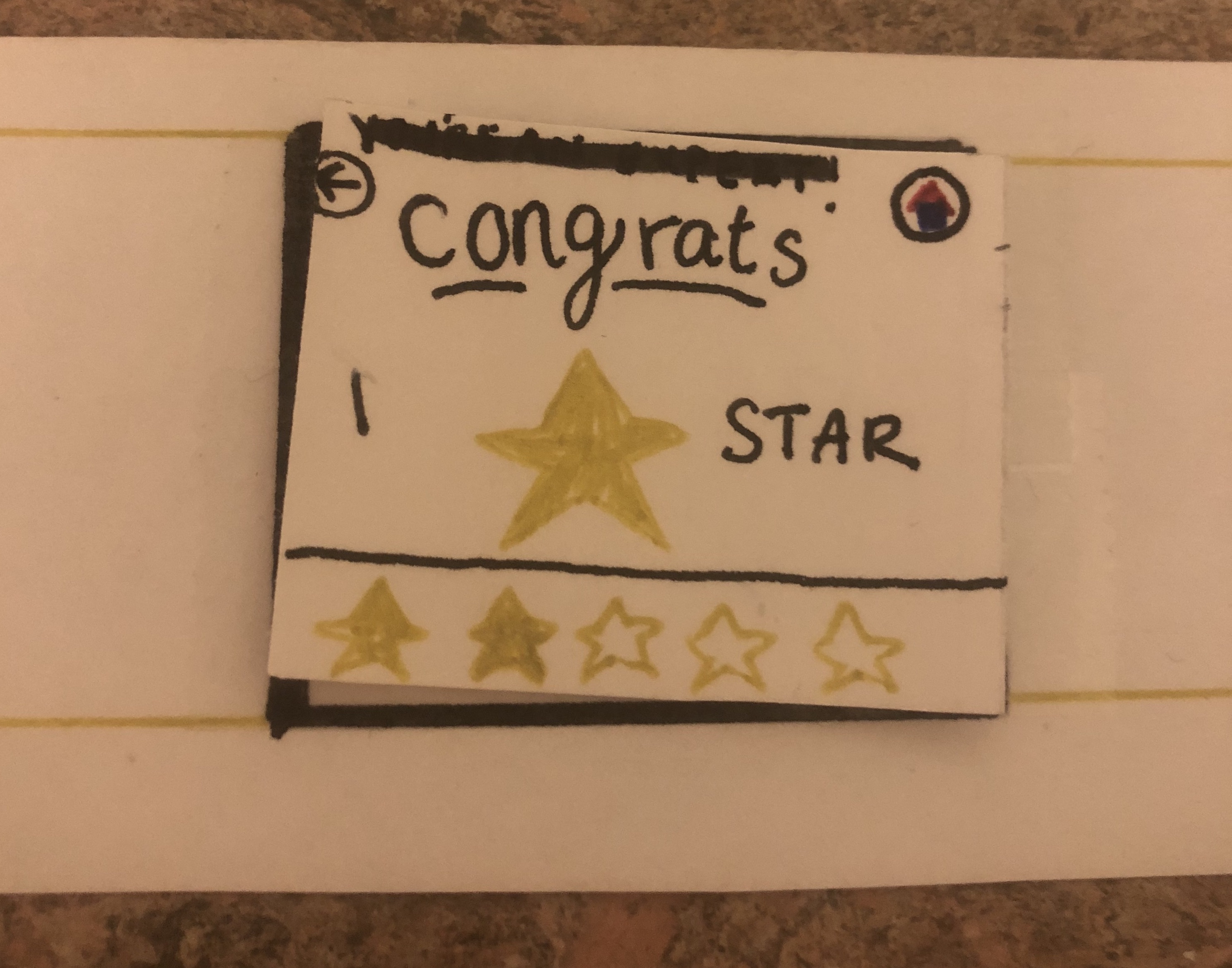
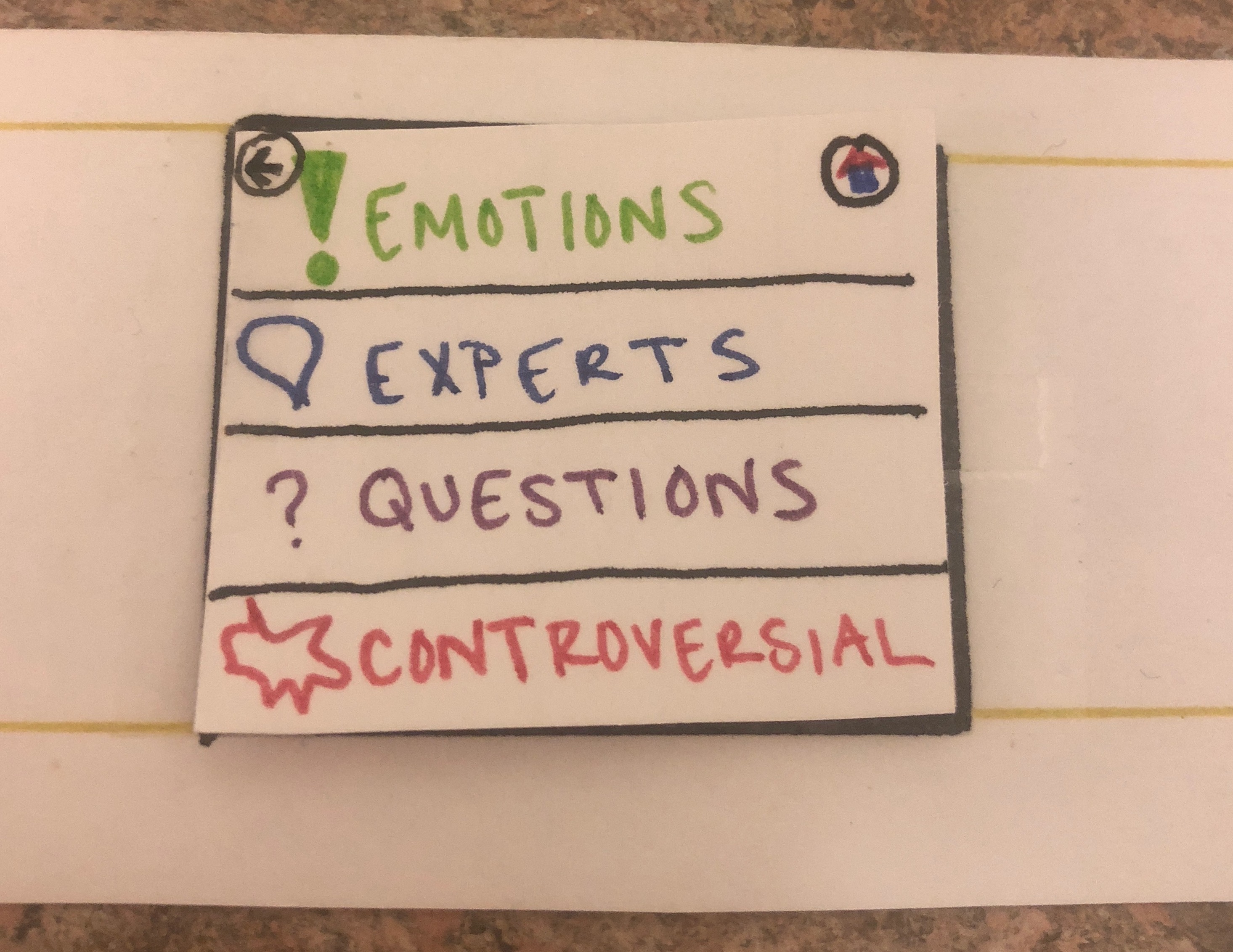
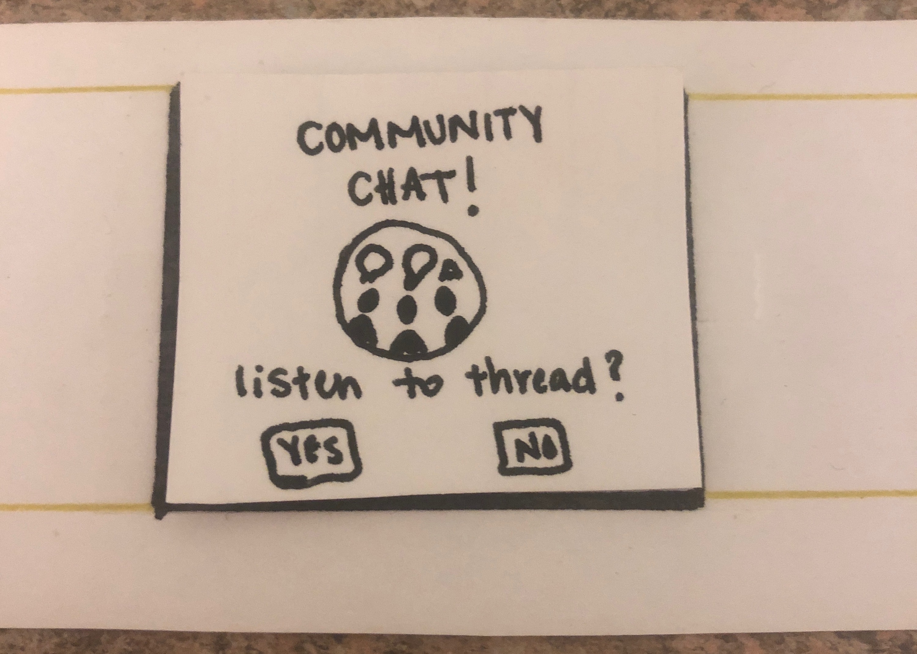
We conducted our first usability test with a Williams college senior history major, E. We chose E as our first tester because she does not consider herself a “museum-person” and typically grows bored in a museum after about an hour. In addition, she does not own a smartwatch, and has never used one before and we wanted to see if our interface was clear for new users (as we expect many of our users to borrow a watch from the museum). We conducted our test in an empty grouping of carrels in the back part of sawyer library. We chose this space because we wanted to mimic the quiet of a museum gallery. Because this space was empty, we felt comfortable speaking aloud softly matching the volume we would use in a gallery. We hung up a small painting and presented the user with our watch and asked them to look at the painting and listen to other interpretations and offer their own in any order they would like. The watch prompted them to choose between listening and recording and the user was free to choose which one to engage in first. After they recorded their interpretation, the user was presented with a reward for offering an interpretation. When they listened to a recording, one member of our group served as the “wizard of oz” and read them a preprepared interpretation of the painting. In the second task, we asked them to click on the “thread” option in order to test the functionality of our collaborative feature. One member of our group again served as the wizard and read them a conversational list of interpretations. Then the user was prompted by the watch to offer their own interpretation. All three of our group members were present for the usability test. One group member served as the wizard that mimics the transition of pages depending on the person’s actions, one member conducted the usability test, and one member served as the notetaker and human actor for the community thread. The main issues that we found during this test were: 1) a lack of understanding with the star reward system, which we addressed with an informative pop-up, 2) the user hit the back button before submitting her recording, which we addressed with an error-prevention pop-up; and 3) swear words used in an interpretation, which we would address with an ai moniter.
Second Test
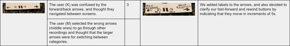
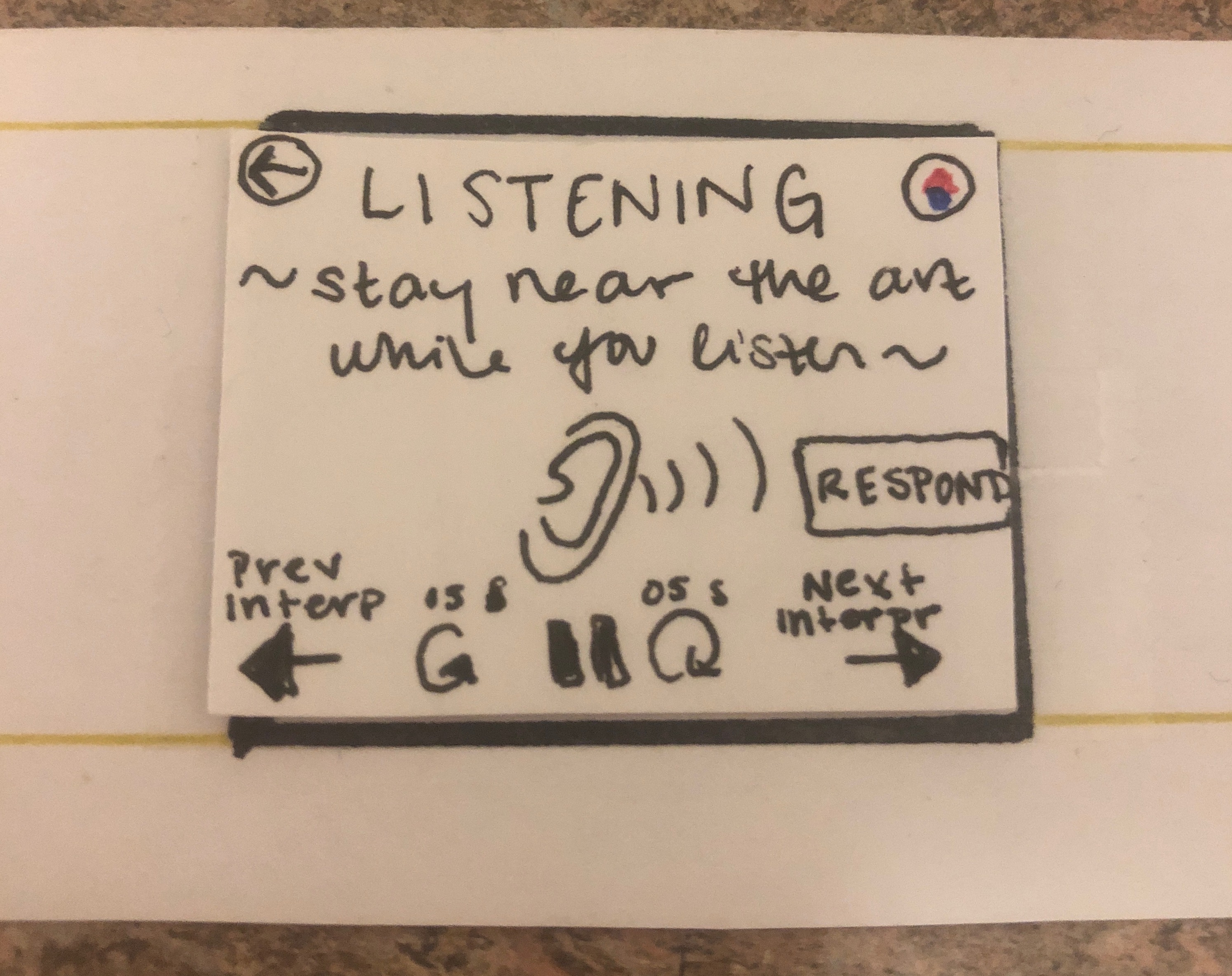
For our second usability test, our user was a junior political science major, K. We used a procedure very similar to the first. The test took place in an empty room in Paresky, where we could have quiet and privacy, while still feeling free to speak aloud. We used the same painting and prepared interpretations as the first test, though we (the group members) changed roles (the wizard became the facilitator, the facilitator became the notetaker, and the notetaker became the wizard). After the first test, we chose to create a pre-recorded response thread for our Community Chat function, and we used that for this test. Another slight difference from the first test was that we chose to ask the participant to conduct each of our 2 main tasks directly, rather than let her decide freely. We did this because we wanted to ensure that we had a chance to show her each screen. In the course of our testing, we encountered a few moments of confusion (i.e. opportunities for revision). First, our user was confused when after submitting a recording, there was no feedback screen. The submit button was greyed-out again, but this feedback was not explicit or noticeable enough to signify that her response was submitted. Then, while listening to a community chat, our participant was confused by the forward and backward arrows. These arrows are meant to navigate between responses, but she thought they would change the screen. And finally, she did not fully understand the Star Reward screen. She thought it meant someone had rated her response highly, when it really means she’s been using InterprArt a lot or very well. Some of these issues could have been avoided had we revises our prototype between tests, but unfortunately we did not do this. To address these areas of confusion, we added labels to the arrows and used informative pop-ups with the recordign screen.
Third Test
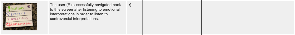
The third usability test was conducted in a group study room in Schow library in order to avoid interruptions or distractions. We chose to not record the usability test because the lighting in the room caused the participant’s shadow to block the paper prototype. The participant was a student at Williams college who was selected because of her expressed interest in art and her affinity towards WCMA and The Clark. The roles for the usability test remained the same in order to improve efficiency. We all felt accustomed the roles we had played in the previous usability test and wanted things to run smoothly. The participant was first given the task of posting an interpretation on an image that she was “near.” The prototype remained the same as the second usability test as well. When the user had finished recording her interpretation she selected the restart arrow underneath the counter and thought that the prototype would replay her recording. She stated that if she were using the design in real life she would have been frustrated from accidentally deleting her recording. This type of interpretation on our design could lead to users closing the application, so it is definitely something to be revised in our hi-fi prototype. The next problem arose when the participant went on the community chat screen and attempted to listen to other recordings by choosing the middle circular arrows on the screen instead of the larger arrows on the edges. When the facilitator asked why she selected this arrow the participant explained that she thought the larger arrows were a means to navigate between categories. Our prototype did not match her mental model of free-roaming between interpretive categories. We as a group thought this was a good idea to consider when making our hi-fi prototype.
Table of Revisions
Three of Our Revisions, In More Detail
First Revision
Clarifying the “next” and “previous” arrows on the Listening screens was a simple, but very important modification. Ambiguous icons can cause frustration and confusion. We saw this first hand with participant K as she attempted to leave the listening screen, but instead kept hearing a new interpretation (the exact opposite of what she wanted!). A frustration like this could cause someone to want to quit the app entirely, especially because the app is providing an elective service, not meeting a necessity. Improving the ease of interaction and reducing frustration increases the chances that users would actually use our app. This is a perfect example of how design the design process focuses on functionality rather than aesthetics. The simple arrows may look cleaner, but the labels increase usability.
Second Revision
Our decision to add a stop and submit button on our record screen was an effective alteration that provided the user with enough feedback to carry out the task. We may reconsider the use of our circular arrow in the screen to be used to playback the user’s recording instead of restarting the recording. We could have the recording restart if the user selects the record button for a third time after already stopping their initial recording. This will probably feel more intuitive and natural to most people. It will also ensure that no user is frustrated for accidentally losing their recording. The interpretations are not meant to be one line comments so it may be very upsetting to a user to lose their well-pondered thoughts.
Third Revision
Also, our use of a popup window is an effective way of preventing any errors during the recording process. By stopping the user for a moment, we ensure that they have genuinely thought through their interpretation and decided that it was exactly what they wanted to say to the rest of the WCMA community. Moreover, the second pop up, the submitted screen, provides some feedback to the user that ensures them that their interpretation has been properly uploaded to the community thread.
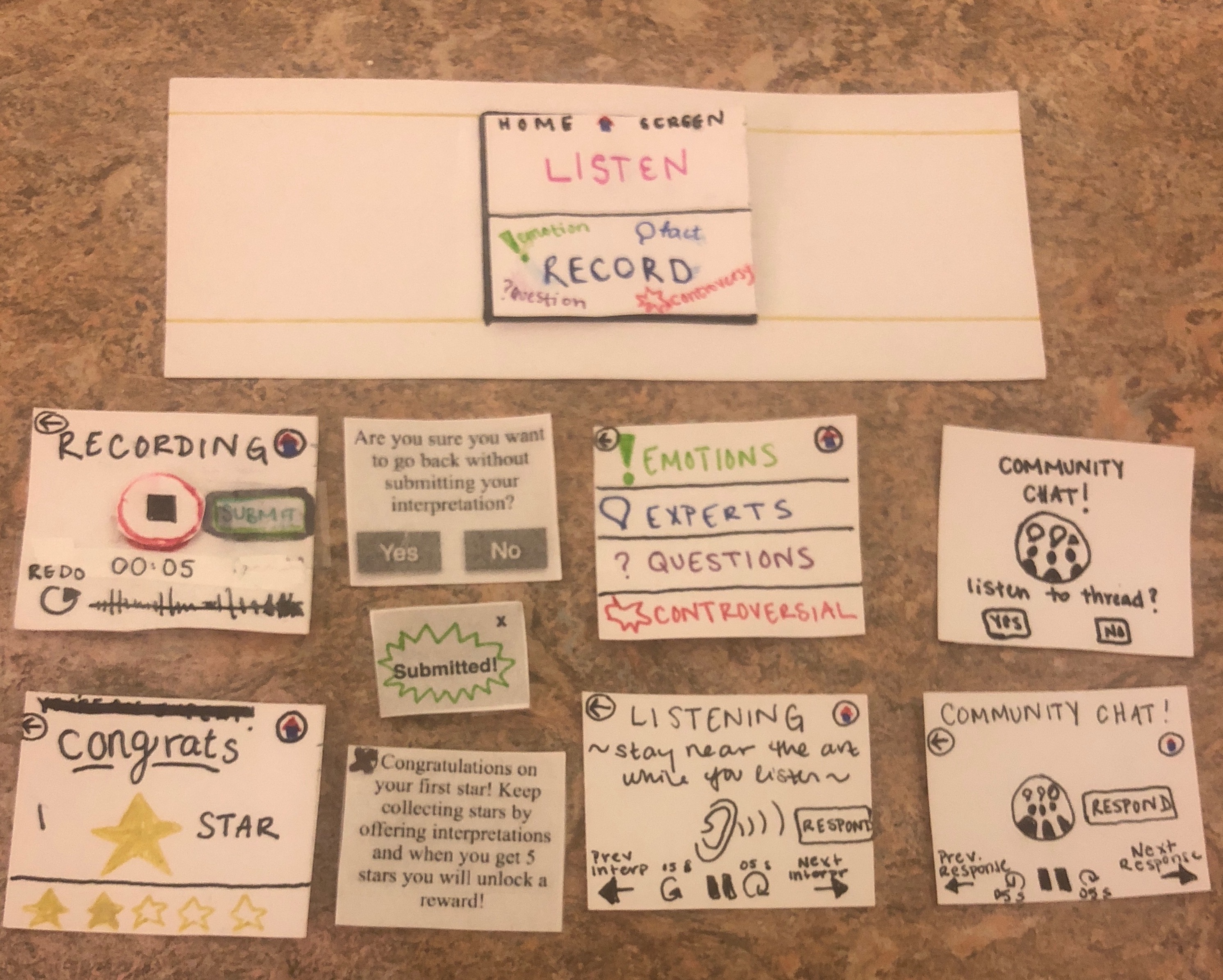
Overview Image of Our Final Prototype
A Walkthrough of Our Main Tasks
Receive Rewards and/or Validation for Interpretations
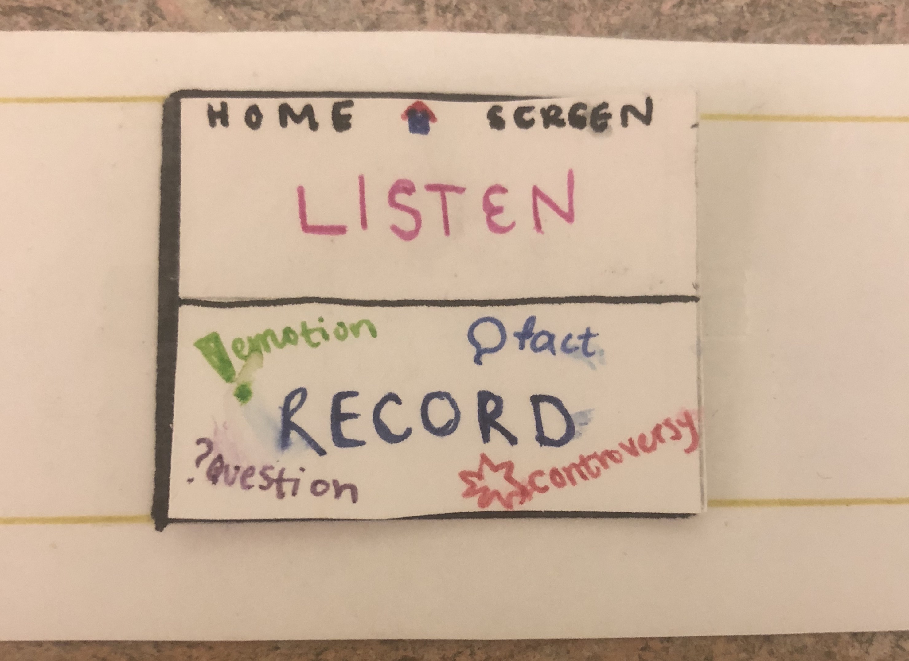
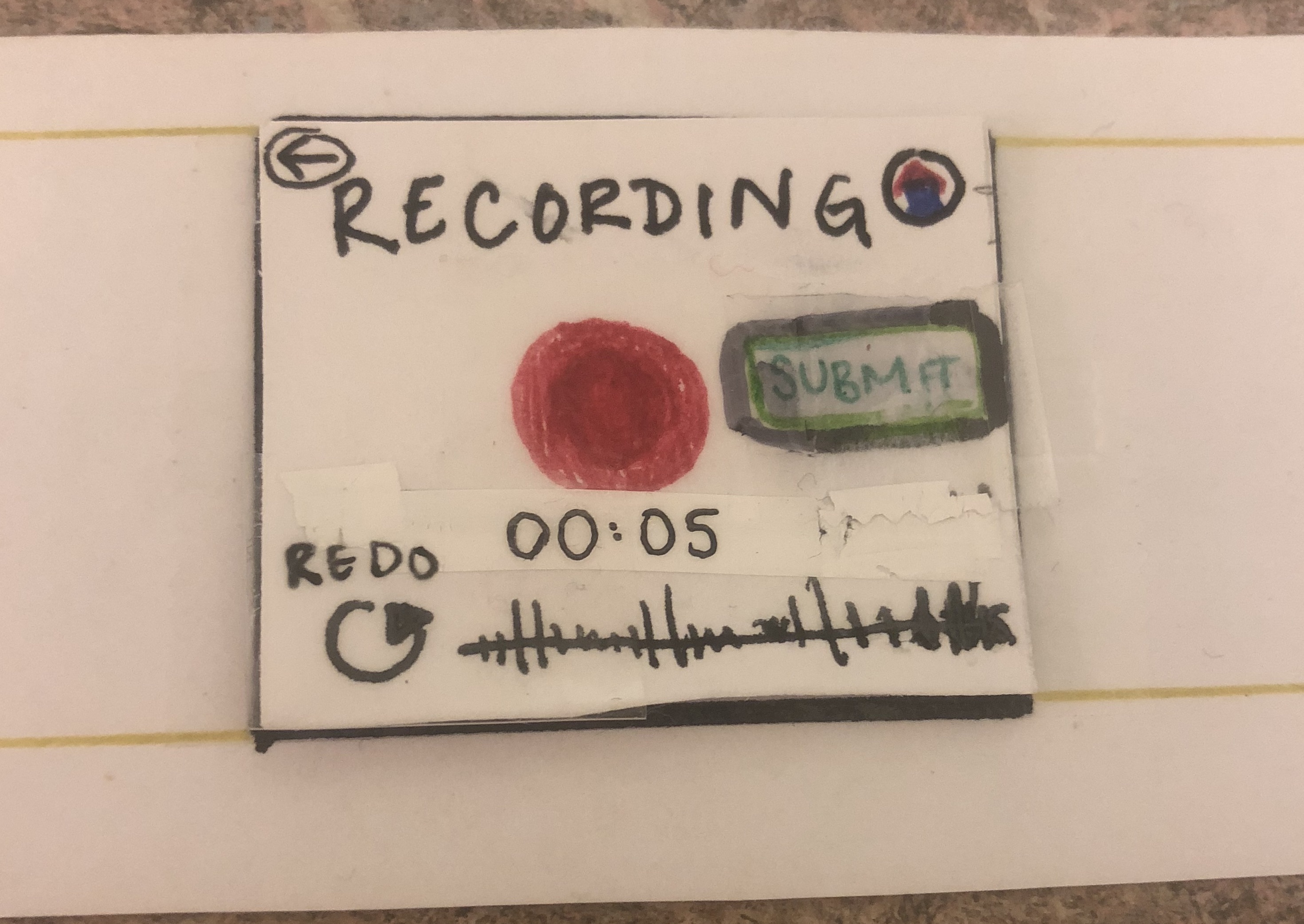
Home Screen, select record.
Record Screen, select recording button.
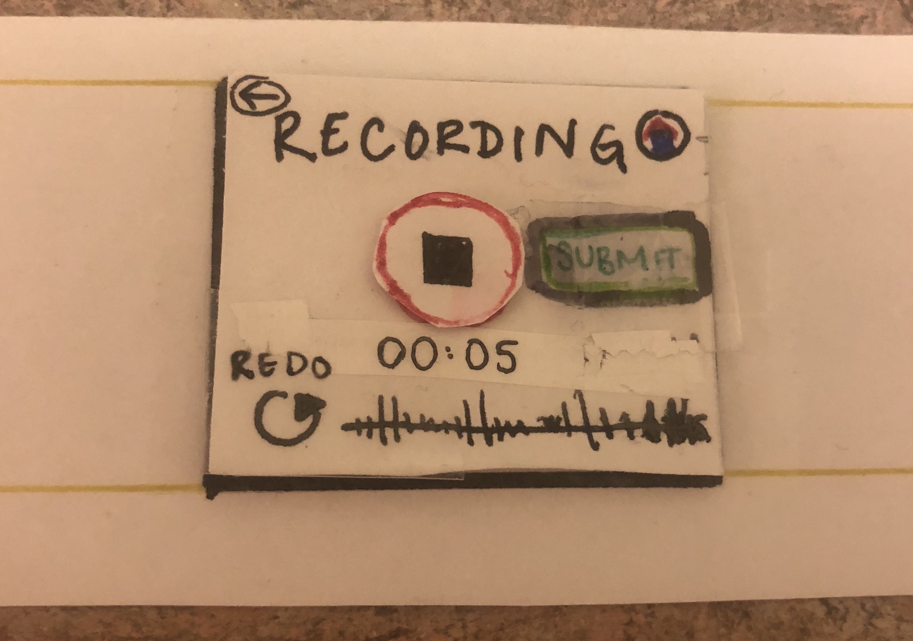
Stop recording and select submit.
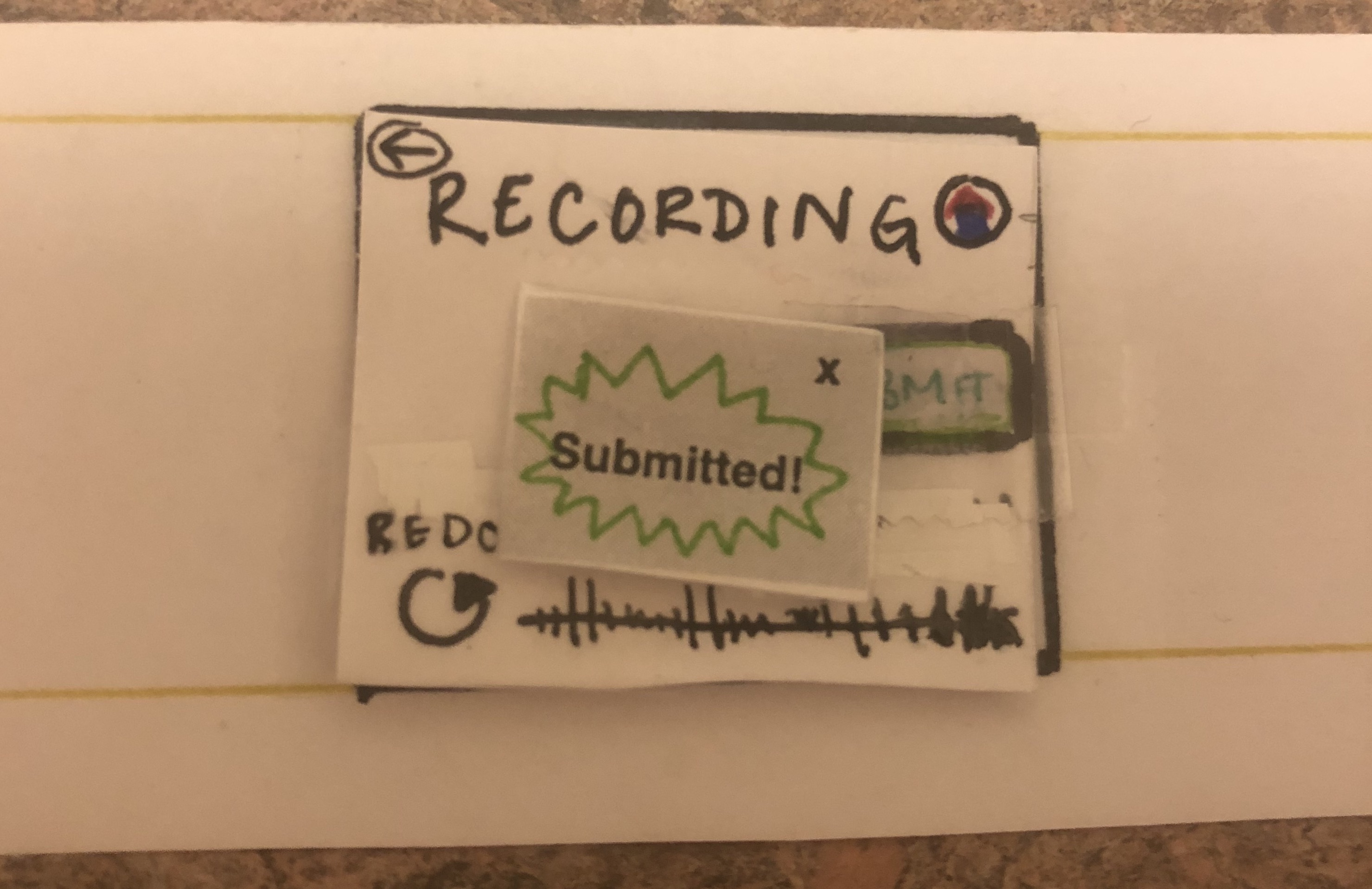
Ex-out of “Submitted!” :
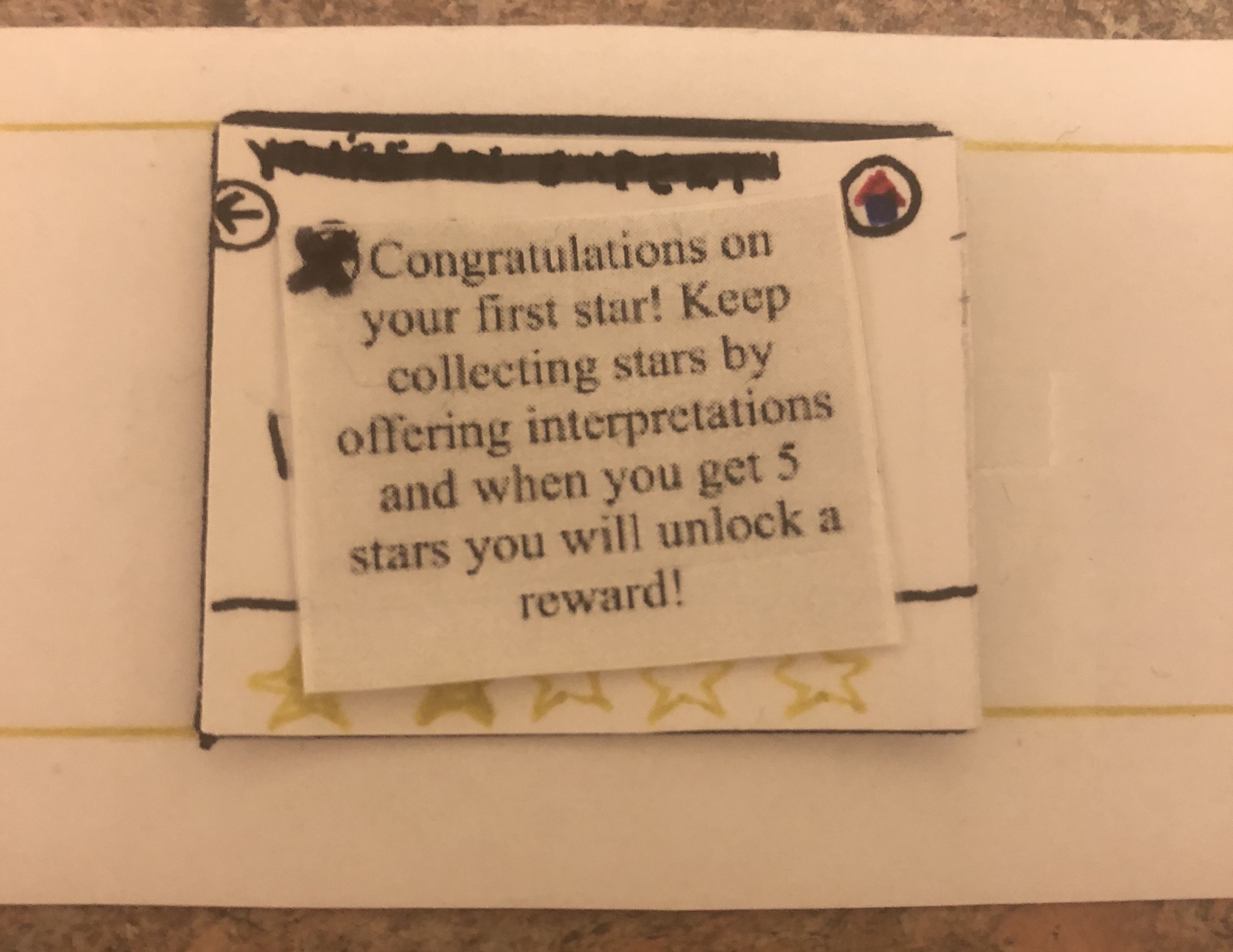
First-Star screen appears. Read message and ex-out.
Star Screen. Press Back or Home icons to return home.
Facilitate Conversation About Art
Home Screen, select listen.
Category Screen, select category.
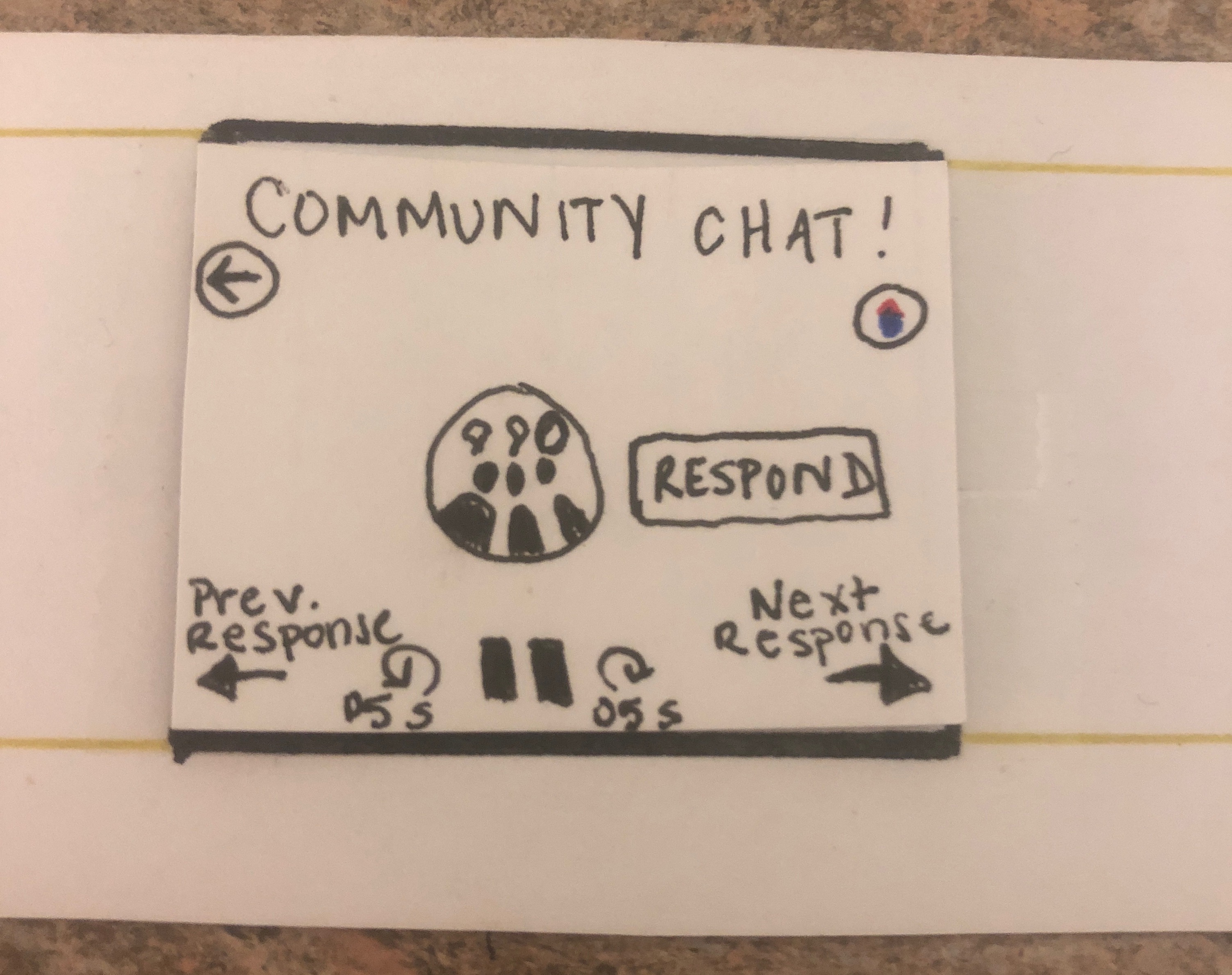
Listen Screen, navigate using arrows and record response as desired.
Community Chat Alert pops up. Choose to listen.
Navigate through chat using arrows (consistent with Listen Screen), and respond as desired.