Group members: Abby Miller, Grace Murray, Maria Mejia
Rotating roles: Designated Delegator, Creative Consult, Logic Liaison
Problem and Solution Overview
There are various categories of people that visit museums, but one category in particular, college students, does not necessarily enjoy the museum-going experience. Many young adults do not consider themselves experts in art or art history. And as a result, college students continuously have less interest and motivation to walk around a museum space and express their thoughts on a piece of art. This lack of participation can stem from a variety of factors such as anxiety on being wrong, a lack of understanding on certain areas of art, or from disapproval of the notion of correct interpretations of art. We decided to provide a solution for anxious students and interpretive rebels alike by providing a digital platform where users can feel heard about their views or opinions on pieces of art specifically at the Williams College Museum of Art (WCMA). The decision to create this discussion as a smart watch design allows the user to be hands-free and mobile during their museum visit so as not to distract from the art itself. Users have the option to either listen or record interpretations and are provided a browsing feature of current interpretations on topics they may find interesting.
Initial Paper Prototype
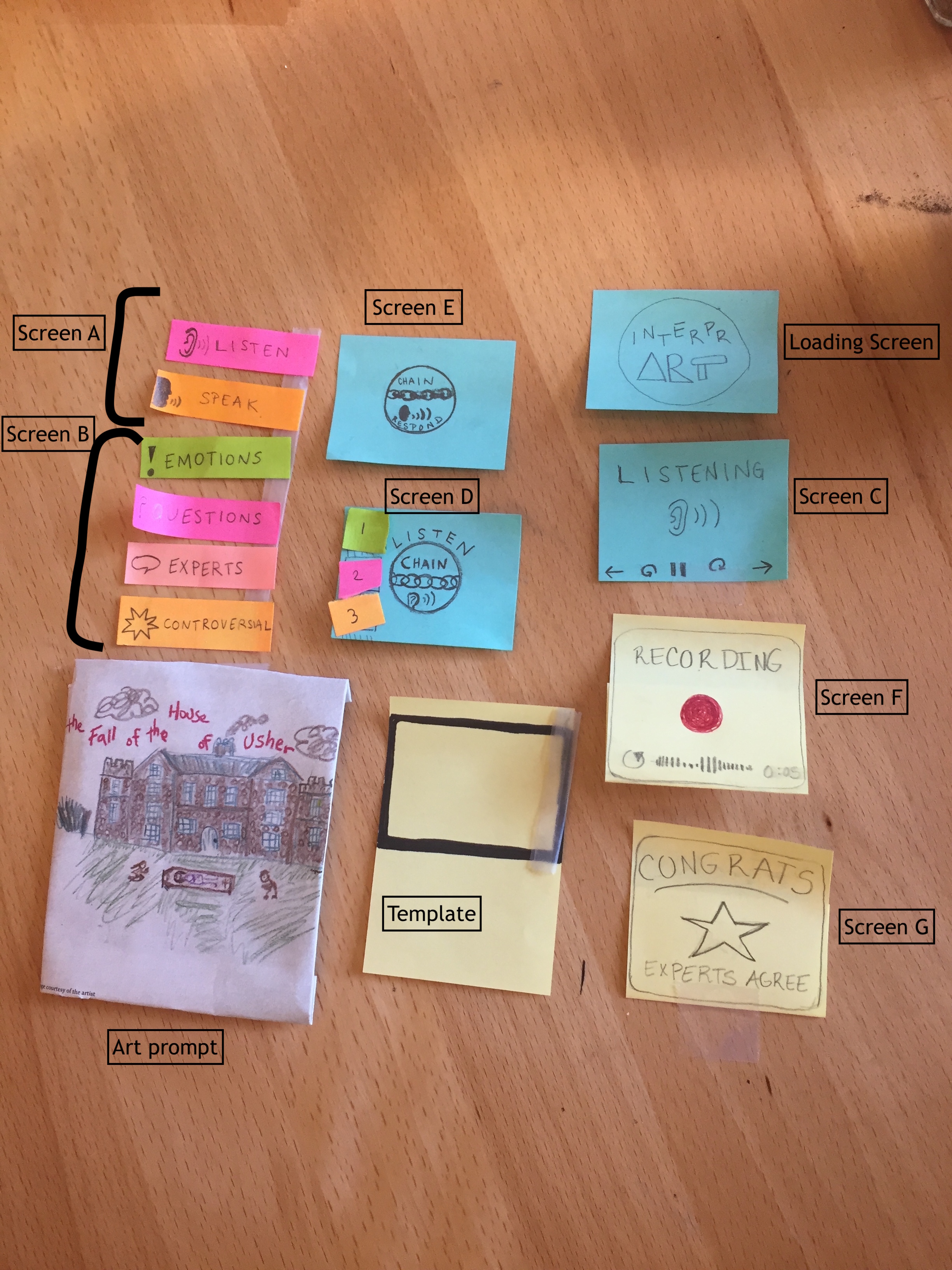
We developed our initial paper prototype using sticky notes and simple drawings. We used a piece of tape on our template to hold down the sticky notes, which tend to curl up. We had only 7 screens, which we used to support our two tasks: Facilitate conversation about art and Receive rewards/validation. Both of these tasks are supported by the two main functions of InterprArt: recording interpretations and listening to interpretations. Thus, the structure of our prototype begins with a home screen on which the user selects either Listen or Record, and subsequent screens then support that choice. The Listen and Record branches do intersect at certain points, like if a user chooses to record a response to an interpretation she is listening to. In this initial iteration of our prototype, the Facilitate Conversation task consisted of: selecting Listen (screen A), choosing a category of interpretations to listen to (Screen B), noticing that a Chain Listen screen has appeared (indicating a pre-existing conversation thread), selecting a numbered response to listen to (Screen D), and choosing to respond or not to the thread(Screen E). Our Receive Validation task consisted of: selecting Record (Screen A), using the recording screen to submit your interpretation (Screen F), and noticing that you have received a star for your interpretation if it met some criteria (Screen G).
Testing Process
First, we conducted two heuristic evaluations with students who were familiar with design heuristics and our design goals. These students performed two tasks using our paper prototype and made a note every time they witnessed a broken heuristic. Next, we conducted usability tests with three Williams college students. Two of our testers did not identify as museum people while one spends a lot of time visiting WCMA and the Clark. We held our tests in study rooms in Sawyer Library, Schow library and the Paresky Center to try to mimic the quiet of a museum. In each of our tests we hung up a small painting and presented our user with a paper prototype of our watch. One member of the group served as the “wizard of oz” and provided the audio functionality of our watch while another conducted the usability test. In our first test, we gave the participant minimal instruction and allowed them to “touch” the watch interface and explore as they wished. In the latter tests, we gave the participant more explicit instructions because we wanted to ensure that they were exposed to more of our screens so we could better understand how to revise our prototype. In the first test we also had all three members of our group present while in latter tests we only had two members conduct the tests. We found that reducing our presence increased the tester’s comfort. After our first test, we also created many more pre-recorded interpretations of our painting and a fake “conversational thread” so that our wizard had more material to read as the tester clicked on different types of interpretations. Finally, we switched around the group member who played the wizard in each test in case one of us was giving the user too much information as the wizard.
Testing Results
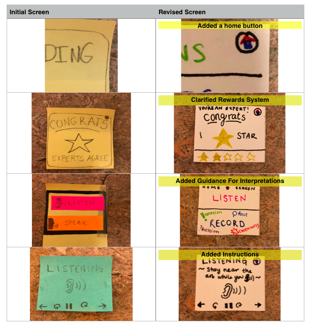
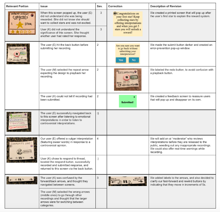
Each of the tests we conducted led to many revisions of our design. From our heuristic evaluation, we realized that most of our screens were missing ways to exit so we added home buttons and back buttons. We also realized that many of our screens needed clearer instructions to explain how the user should navigate the interface. For example, testers did not understand our rewards system for offering interpretations and did not understand what it meant to listen to a thread. We also forgot to put a time-bar under the recording screen so the user could not see how long their recording was. Finally we edited some of our icons to better align with our testers’ mental imagery. Our usability test inspired further changes to our prototype. We realized that we add no button to skip ahead to a new interpretation so we added next and previous buttons to our listening screens. We also realized that our recording screen did not allow the user to stop recording so we added separate stop and submit buttons so that the user could consider their recording before submitting it. We also added pop-up instruction windows to explain the rewards system and to check to make sure that a user wanted to leave a window without submitting their interpretation.
Example Changes From Our Heuristic Evaluation
Example Changes From Our Usability Testing
Final Paper Prototype
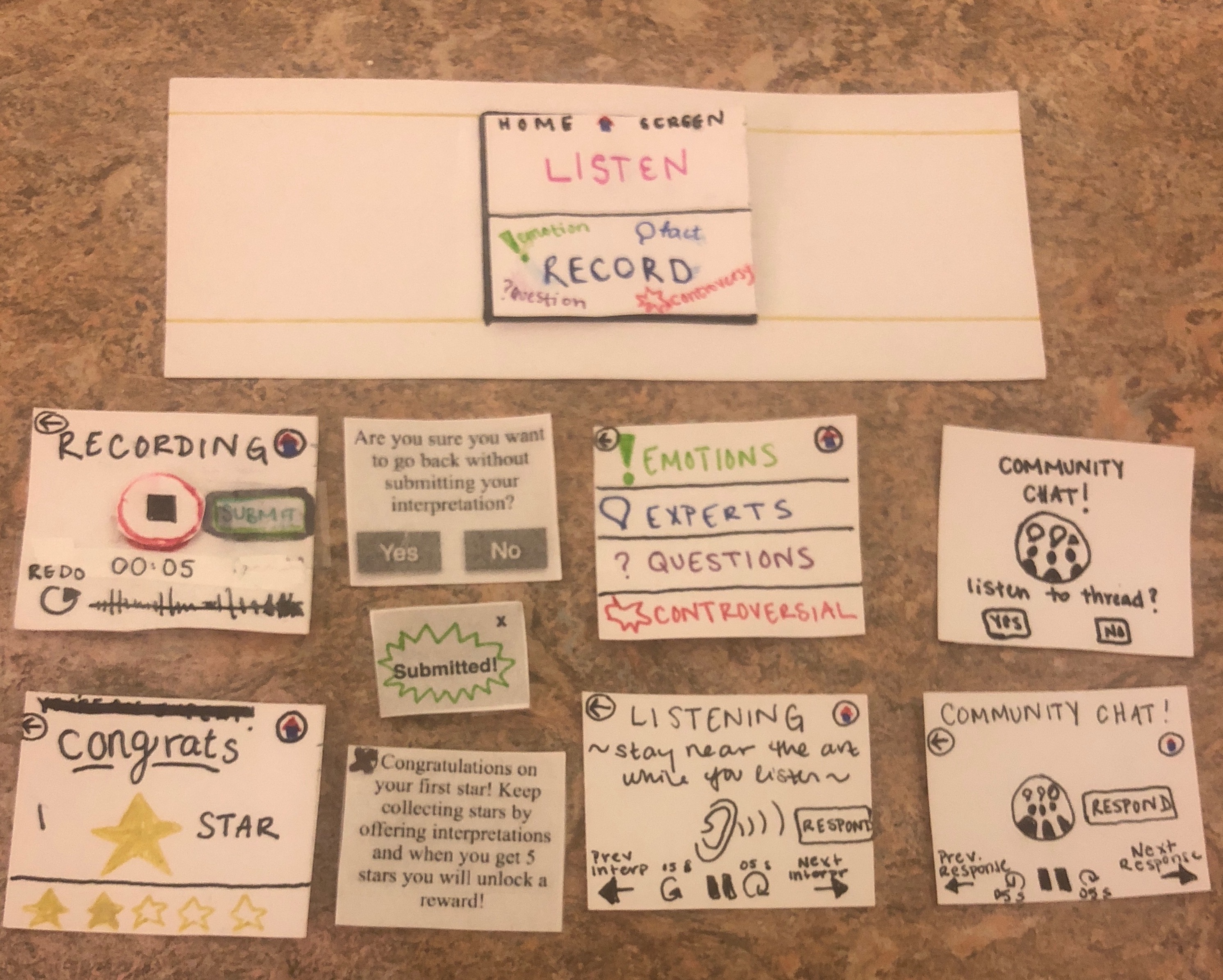
The final paper prototype was created by considering all the critiques and evaluations made on our initial prototype, which mostly had to do with user feedback. The most evolved screens would be our community chat screen and the recording screen. The recording screen now provides a clear way to submit an interpretation and the actual record button changes symbols to signal when a user begins to record their interpretation. By changing the word “chain” to “community chat” in our threads of messages, we hope to avoid our initial problem of confusion about the meaning of the word “chain” on the (now) community chat screen. Also, we made sure to add home and back buttons to all our screens so that users can navigate through the design easily. Our first task was to have a user submit a recording on a piece of art that they are interested, which travels from the home screen (Listen / Record) to the congrats or submitted screen. The second task is when a user decides to listen to other interpretations on another piece of art that piqued their interest. The tasks starts by pressing the “Listen” button on the home page and ends with a screen that contains one recording with the options to navigate between similar interpretations or further comments.
Digital Mockup
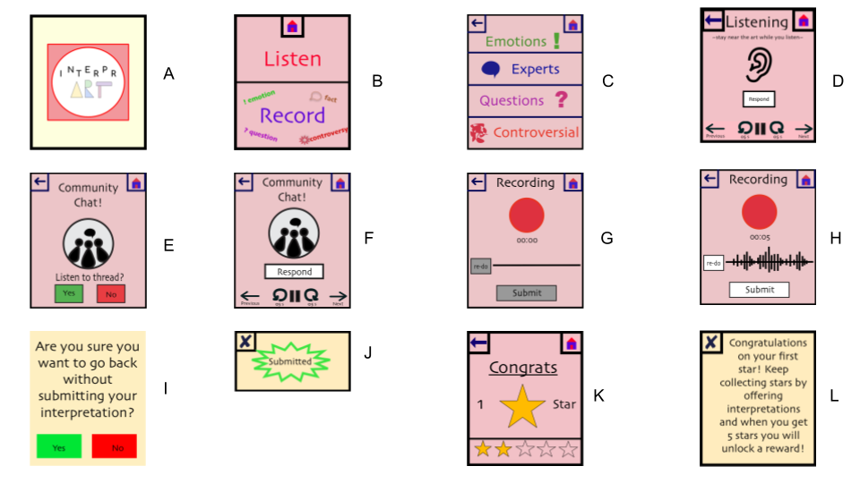
Above is an overview image of our digital mock up, which included screens supporting our two main tasks: Facilitate conversation about art and Receive validation. The Facilitate Conversation task consisted of: selecting Listen (screen B), choosing a category of interpretations to listen to (Screen C), listening and using the arrows and controls to navigate between interpretations and play/pause/fast-forward/rewind (Screen D), noticing that a Chain Listen screen has appeared and choosing to listen or not (Screen E), and then listening the thread and choosing to respond or not (Screen F). Our Receive Validation task consisted of: selecting Record (Screen B), using the recording screen to submit your interpretation (Screens G and H), noticing the error-prevention pop up (Screen I) and Submitted pop up (Screen J), and noticing that you have received a star for your interpretation (Screen K), and reading the explanation pop-up if it was your first one (Screen L).
We made only minute changes in transitioning from our paper prototype to digital mockup because we have revised our prototype so thoroughly. On our listening screen, we moved the location of the Respond button because the dimensions of our watch differed from the prototype and it no longer fit well next to the ear icon. In addition, we created a unified color scheme for all of our screens and chose one font (Skia) to be represented all throughout our smartwatch application. We also designed unified/consistent home buttons, back buttons, exit buttons and play/pause button. In creating the record screen, we also decided to rearrange the elements. In our paper prototype, the Submit button was off-center, next to the record screen. In our usability testing, one of our participants hit the back button before pressing submit. We chose to handle this by including an error-prevention pop-up warning. We decided to also move this button so that it is below the recording button and timer. We feel this will add a more logical flow to the screen, as it suggests a more clear order of actions.
Pink and red are two key colors in our logo design, but in attempting to include these as prominent features in our digital mock up, we ended up with an unsophisticated and somewhat garish color scheme. In a future iteration, we would use the following color scheme (adjusting our logo to match), generated on coolors.co:
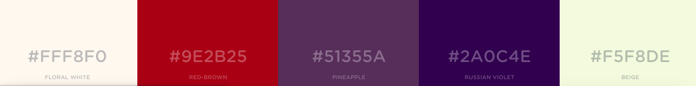
This scheme maintains the general idea of our original color scheme, but refines it and tones it down.
Discussion
This project has taught us about the importance of separation between user and designer. Since we are all college students, we wanted to create an app that would cater to our needs, but neglected to consider other types of users. Because of this, our app for art amateurs became one of many digital discussion boards produced by the overall class. Our ideas became similar because we all projected our point of view as college students on to the potential and current visitors of WCMA. Furthermore, the process of iterative design validated our confidence with trial and error. We were much more willing to pitch new ideas and have them rejected as opposed to constantly stressing over one idea and hoping that it ends up being right. It helped us get rid of any preconceived notions or assumptions we had about our project not necessarily by illuminating the “correct” design path, but rather by crossing out the designs that cannot function and allowing us the freedom to find new methods or ideas that would work with our own interests. Our final design, as a result of this process, is far from the original image that anyone in InterprArt initially visualized. The smartwatch design process forced us to learn that “less is more” and our initial task flows would be too complicated and a more streamlined version would be favorable to users. This intuitively makes sense because less actions means less room for confusion. Despite our own intuitions and the helpful testing participants, we would have benefitted from more iterations upon our design. More specifically, it would have been nice to create iterations of our design with smaller changes among them as we learn different topics in Human-Computer Interaction (HCI). For example, we could have tested the functionality of our design in black and white and added color after we were introduced to color theory.