Digital Mockup
Prototype:
Walk-Through:
TASK 1: Facilitate Conversation and Collaboration About Art
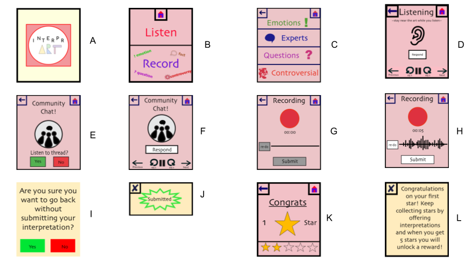
Our watch uses location tracking to sense which work of art the user stands in front of. Then our home screen offers the user two options. They can either listen to other interpretations or record their own.
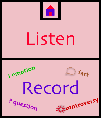
If they click listen, then they are given a menu of options for different types of interpretations they can listen to. They can hear statements from others about how the work of art made them feel, they can listen to questions about the art, they can hear expert interpretations of the art or hear controversial interpretations. The user clicks on the category that corresponds to their interest.
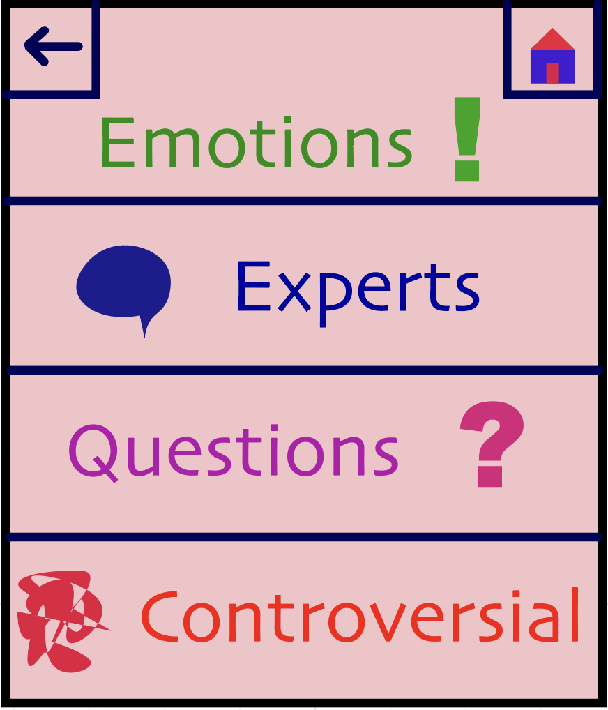
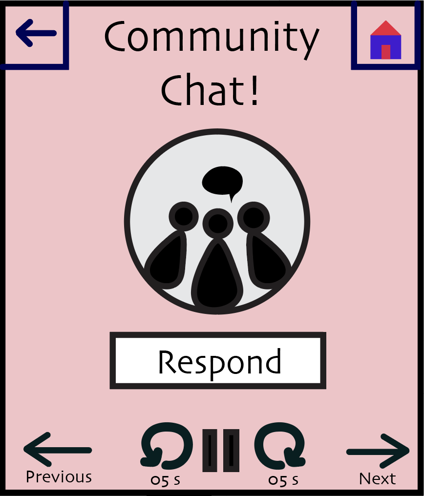
Once the category is selected, the screen changes to display buttons that can pause, play, fastforward, or rewind the audio, and the interpretations start playing.
In the event that other users have responded to a particular interpretation, a notification pops up alerting the user to the chain and allowing them to listen to the responses, if they so choose. There are navigation arrows to move between interpretations, which prevents the user from having to listen to all of them.
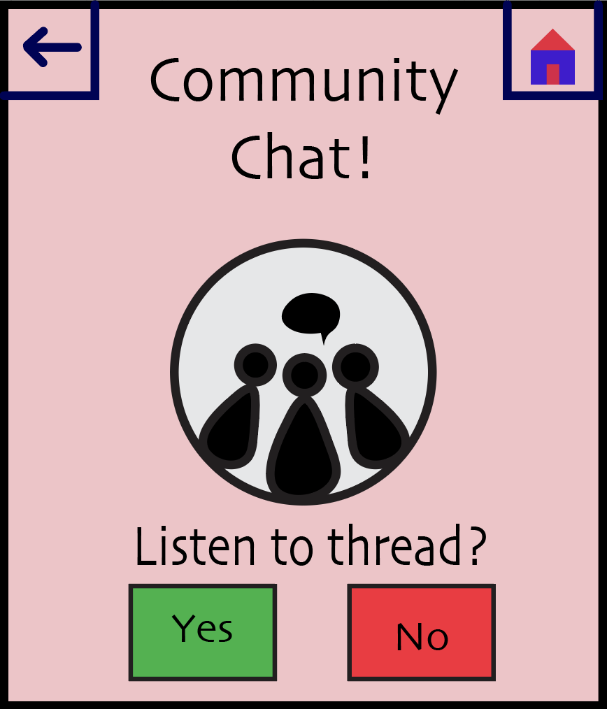
The community chat screen is displayed while they listen to these responses.
Task 2: Recieve Rewards and Validation for Interpretations
The user can either choose listen to other interpretations or record their own.
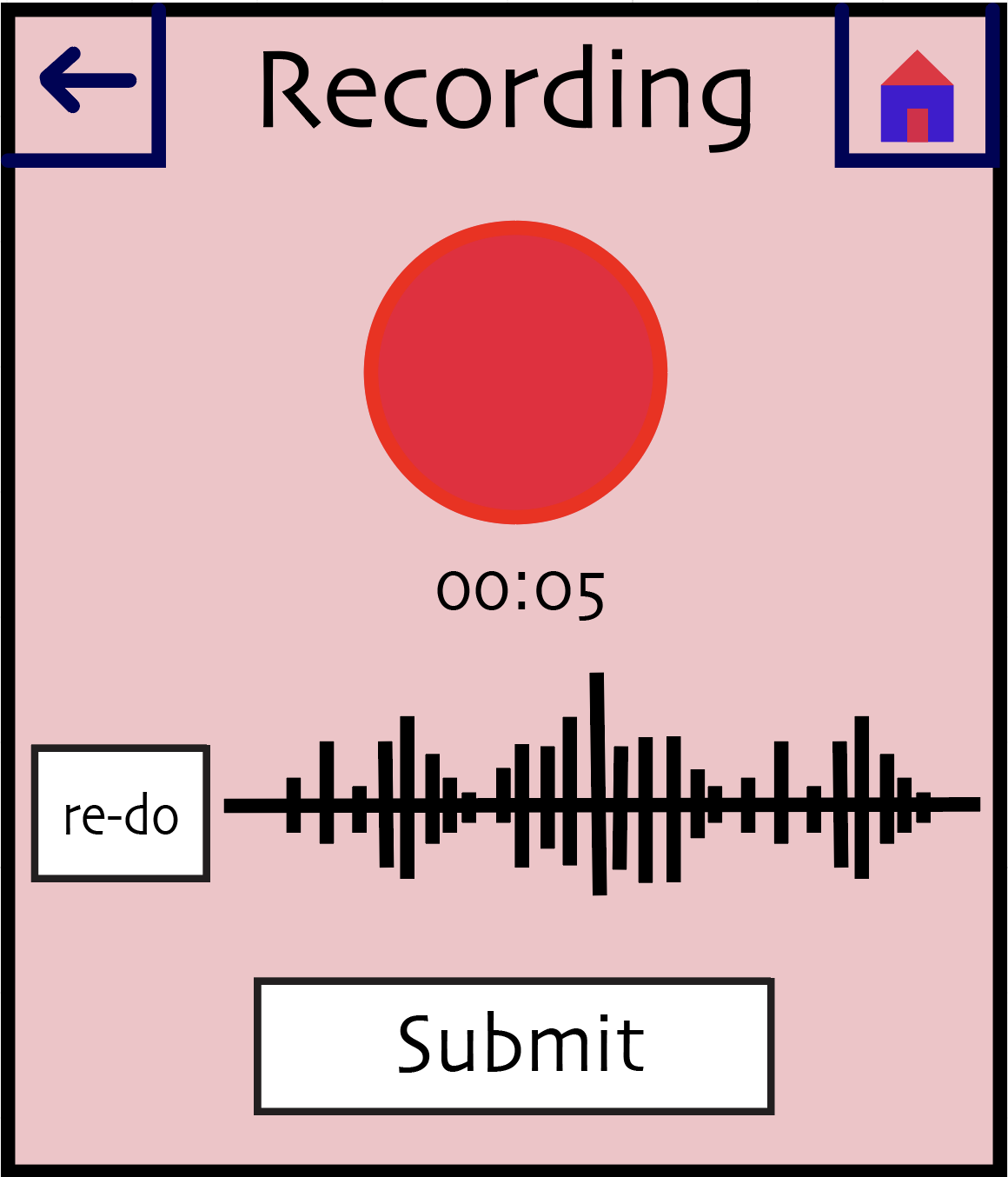
If they choose record, the recording screen appears.
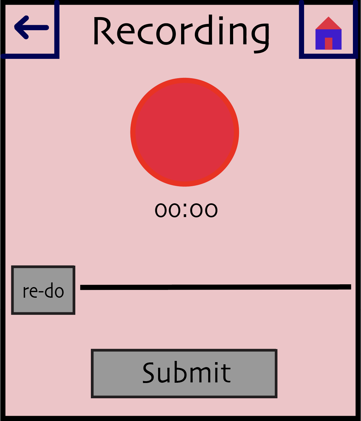
After they have recordeed something, the submit and redo buttons are activated.
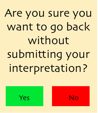
If they attempt to leave without submitting, a warning is displayed.
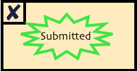
Once submitted, a confirmation pops up.
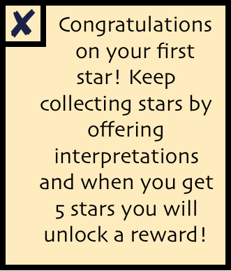
Sometimes, the user will receive a reward in the form of a star for their interpretations. This could happen every time they have reached a milestone of submitting 10 interpretations. If this is their first star, they will receive an explanation.
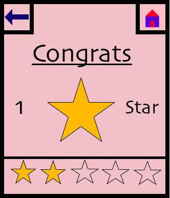
Otherwise, the star screen is displayed with no explanation.
Changes:
We made only minute changes in transitioning from our paper prototype to digital mockup because we have revised our prototype so thoroughly. On our listening screen, we moved the location of the respond button because the dimensions of our watch differed from the prototype and it no longer fit well next to the ear icon .In addition, we created a unified color scheme for all of our screens and chose one font (Skia) to be represented all throughout our smartwatch application. We also designed a unified home button, back button, exit button and play/pause screen. In creating the record screen, we also decided to rearrange the elements. In our paper prototype, the Submit button was off-center, next to the record screen. In our usability testing, one of our participants hit the back button before pressing submit. We chose to handle this by including an error-prevention pop-up warning. We decided to also move this button so that it is below the recording button and timer. We feel this will add a more logical flow to the screen, as it suggests a more clear order of actions.