Usability Testing Checkin
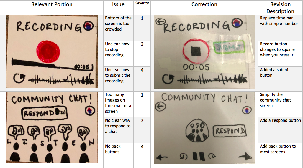
Cognitive Walkthrough Table
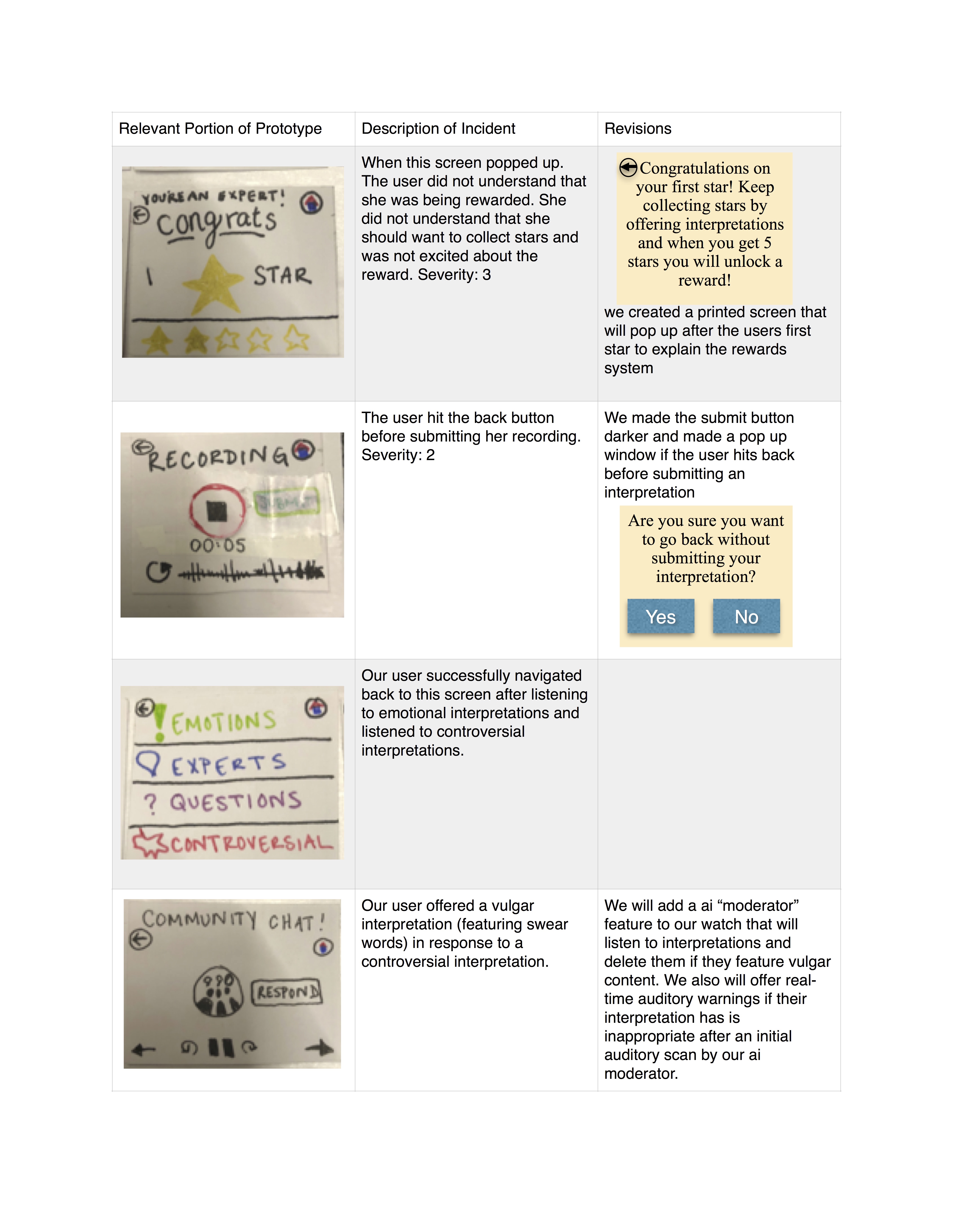
Usability Test Report
We conducted our first usability test with a Williams college senior history major, E. We chose E as our first tester because she does not consider herself a “museum-person” and typically grows bored in a museum after about an hour. In addition, she does not own a smartwatch, and has never used one before and we wanted to see if our interface was clear for new users (as we expect many of our users to borrow a watch from the museum). We conducted our test in an empty grouping of carrels in the back part of sawyer library. We chose this space because we wanted to mimic the quiet of a museum gallery. Because this space was empty, we felt comfortable speaking aloud softly matching the volume we would use in a gallery. We hung up a small painting and presented the user with our watch and asked them to look at the painting and listen to other interpretations and offer their own in any order they would like. The watch prompted them to choose between listening and recording and the user was free to choose which one to engage in first. After they recorded their interpretation, the user was presented with a reward for offering an interpretation. When they listened to a recording, one member of our group served as the “wizard of oz” and read them a preprepared interpretation of the painting. In the second task, we asked them to click on the “thread” option in order to test the functionality of our collaborative feature. One member of our group again served as the wizard and read them a conversational list of interpretations. Then the user was prompted by the watch to offer their own interpretation. All three of our group members were present for the usability test. One group member served as the wizard that mimics the transition of pages depending on the person’s actions, one member conducted the usability test, and one member served as the notetaker and human actor for the community thread.
Lessons from the Testing Process
We learned that we should have practiced our tests even more because we had a brief blip and forgot to display the correct recording screen when responding to a conversational thread. In addition, we learned that our wizard should be prepared with more interpretations about the art because our user kept hitting the back button and clicking on new interpretations and we eventually ran out. Finally, we learned that usability tests are a little bit awkward and that it might make our user more comfortable if they were not being watched by three people (it seems possible for us to perform the test with only two). We can also work to change our mannerisms to seem even less judgemental to make the user feel more comfortable clicking on the paper interface.
Plan for Future Tests
Since our project is intended for college students or young people that are novices to the museum-going experience, we will target other college students for our usability tests. We hope to find more holes in our design or feedback on how to improve the overall flow of the process to complete either one of our tasks. The small screen on the apple watch forces us to think carefully about every visual element that we add to the screen. Too many buttons or text and the user will be overwhelmed by the tiny size of our text and images. We plan to try having only two group members run the next test in order to create a more comfortable environment for the user. We also will practice the test twice beforehand to make sure it runs smoothly and we will prepare more prerecorded speeches for the wizard. We also will prepare a prerecorded chat thread with different voices reading interpretations so it feels more realistic. We intend to record our usability test mostly as practice using different testing methods. Also, we will ensure that we do not guide the participant on the process for completing a task and only assist with smaller questions that do not pertain to our test.
Usability Testing Table